Make a mathematical visualizer and perform an experiment
You're gonna learn a ton!

I am a 12 year old student developer from India. I like programming very much.
Today, we'll make and perform a Maths experiment, but with the help of Web development. It's gonna be fun, I guess! For those who just want the code, jump to the last section. https://raghavgulia.github.io/pi-visualizer/
The experiment 🧪
Let's say that we have a circle inscribed inside a square. If we randomly put points on it, the probability of getting it on the circle is one-fourth of PI.
In other words, if we put many points randomly on it, divide the points in the circle by the number of points, and then multiply the value by 4 we'll get a number close to PI.
The value of PI🥧
For those of you who don't know the value of PI, it is 3.141592653589793......
You can also check it by:
console.log(Math.PI)
The project
HTML 🏢
For the HTML, first set up the boilerplate code and attach the CSS and JS file
<!DOCTYPE html>
<html lang="en">
  <head>
    <meta charset="UTF-8" />
    <meta http-equiv="X-UA-Compatible" content="IE=edge" />
    <meta name="viewport" content="width=device-width, initial-scale=1.0" />
    <title>Document</title>
    <link rel="stylesheet" href="style.css" />
    <script src="script.js" defer></script>
  </head>
  <body></body>
</html>
Then add a container with the class cont and enclose a square in it:
<div class="cont">
  <div class="square" id="h"></div></div>
</div>
Now enclose a circle inside the square
<div class="cont">
      <div class="square" id="square"><div class="circle square"></div></div>
</div>
Note: I'm reusing the class square and adding a border-radius for the circle
Now just add input and a button.
<input type="number" name="dots" id="dots" placeholder="Input no. of dots"/>
<button id="button">click</button>
And that's it for the HTML. It should look like this:
<!DOCTYPE html>
<html lang="en">
   <head>
      <meta charset="UTF-8" />
      <meta http-equiv="X-UA-Compatible" content="IE=edge" />
      <meta name="viewport" content="width=device-width, initial-scale=1.0" />
      <title>Document</title>
      <link rel="stylesheet" href="style.css" />
      <script src="script.js" defer></script>
   </head>
   <body>
      <div class="cont">
         <div class="square" id="square">
            <div class="circle square"></div>
         </div>
      </div>
      <input
         type="number"
         name="dots"
         id="dots"
         placeholder="Input no. of points"
         />
      <button id="button">click</button>
   </body>
</html>
The CSS 🌻
For the CSS, we will first get rid of the default browser margins and padding
*,
*::before,
*::after {
  margin: 0;
  padding: 0;
  box-sizing: border-box;
}
Then we will make a class for the square. We'll give it a width and height of 500px and give it a background color of blue. Also, we'll change its position to relative and give it a slight border.
.square {
  width: 500px;
  height: 500px;
  background-color: blue;
  border: 1px solid black;
  position: relative;
}
Now we'll make a class for the circle. We'll just simply make it round by border-radius: 50%.
.circle {
  border-radius: 50%;
}
Next, we'll make a class for the points/dots that we'll show. We'll give it a length and breadth of 10px, make it round and change its position to absolute. Also, we have to translate it -50%, -50% to center it.
Finally, we have to make a class for the dots inside the circle.
.inside {
  background-color: red;
}
That's the CSS! It should look like this:
*,
*::before,
*::after {
  margin: 0;
  padding: 0;
  box-sizing: border-box;
}

.square {
  width: 500px;
  height: 500px;
  background-color: blue;
  border: 1px solid black;
  position: relative;
}

.circle {
  border-radius: 50%;
}

.dot {
  width: 10px;
  height: 10px;
  background-color: black;
  transform: translate(-50%, -50%);
  position: absolute;
}

.inside {
  background-color: red;
}
JS part 1 ⌨
Now to JavaScript, we first select the DOM elements that we need.
const dotsInput = document.getElementById("dots");
const button = document.getElementById("button");
const square = document.getElementById("square");
Now we add an event listener on button and define a variable called count in it. The count variable will keep track of how many dots are in the circle.
button.addEventListener("click", () => {
  let count = 0;
});
Then we will change the innerHTML of the square to be the circle so that whenever the button is clicked again it gets reset.
square.innerHTML = `<div class="circle square"></div>`;
The Maths and logic ➕➖✖➗
First, we need to understand how to check if a point is inside a circle or not. If
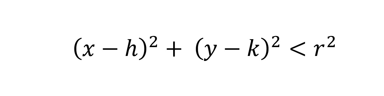 .
.
x and y here means the x and y coordinate of the point respectively. h and k means the coordinates of the center of the circle. This may be tough, but I hope you understand! 😃
Finding the center of the circle ⭕
First look at this illustration that I made:
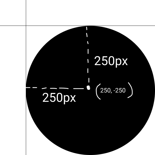
Take the 2 axes as the side of the square and take the top edge (0, 0). Now go down 250px and go 250px right and voila, we have the center of the circle!
So the center of the circle is 250, -250 right? Well technically yes, but no as the battle between the geometry of the web and maths kick in.
Web Geometry vs Maths ⚔⚔
Well, there's a big difference, I mean BIG difference between the geometry of normal Maths and web dev. You see, whenever we do top value in CSS, we generally use positive values instead of negative. Why? Because the Y-axis in Web development is positive when downwards and negative when upwards, which is completely opposite of normal Maths. So, let's write try to find the center of the circle once more!
The "new" center 🔴
We just multiply the y part of the center with -1, and we have the center as (250, 250).
But we also have to change the equation accordingly, so it becomes
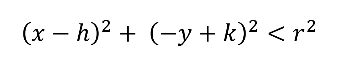
But the (y-k)^2 part is the same, just multiplied by -1. And we all know the square of -1 is 1, so the equation is the same.
JS part 2 ⌨
So let's come back to code. We'll start a loop that repeats itself the number of times it was written in the input dotsInput.
for (let index = 0; index < dotsInput.value; index++) {

}
Now in the loop, let's define the x and y coordinates of the dots. Remember, they are between 0 and 500.
let x = Math.random() * 500;
let y = Math.random() * 500;
Now to check if the dot is inside the circle, we use the formula
const inside = (x - 250) ** 2 + (y - 250) ** 2 < 250 ** 2;
Next, we increase the value of count if the dot is inside the circle:
if (inside) count++;
Now, we finally add the dots and give them the class according to inside:
square.innerHTML += `<div class="dot circle ${
inside ? "inside" : ""
}" style="top:${y}px;left:${x}px;"></div>`;
And we are almost done! Now just alert (count / dotsInput) * 4 outside the loop and you're done 🤩🤩.
alert((count / dotsInput.value) * 4);
That's it! Your JavaScript should look like this:
const dotsInput = document.getElementById("dots");
const button = document.getElementById("button");
const square = document.getElementById("square");

button.addEventListener("click", () => {
  let count = 0;
  square.innerHTML = `<div class="circle square"></div>`;
  for (let index = 0; index < dotsInput.value; index++) {
    let x = Math.random() * 500;
    let y = Math.random() * 500;
    const inside = (x - 250) ** 2 + (y - 250) ** 2 < 250 ** 2;
    if (inside) count++;
    square.innerHTML += `<div class="dot circle ${
      inside ? "inside" : ""
    }" style="top:${y}px;left:${x}px;"></div>`;
  }
  alert((count / dotsInput.value) * 4);
});
So that's it! Hope you like it! It took a lot of time to make!
The result
Let's try and put 500. The result is 3.512, pretty close. And here are the dots
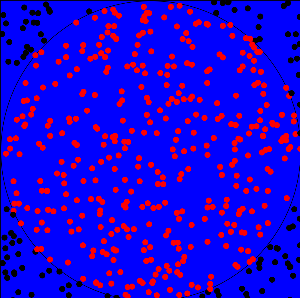
And remember, they are random and you made this project!
All the code
<!DOCTYPE html>
<html lang="en">
  <head>
    <meta charset="UTF-8" />
    <meta http-equiv="X-UA-Compatible" content="IE=edge" />
    <meta name="viewport" content="width=device-width, initial-scale=1.0" />
    <title>Document</title>
    <style>
      *,
      *::before,
      *::after {
        margin: 0;
        padding: 0;
        box-sizing: border-box;
      }

      .square {
        width: 500px;
        height: 500px;
        background-color: blue;
        border: 1px solid black;
        position: relative;
      }

      .circle {
        border-radius: 50%;
      }

      .dot {
        width: 10px;
        height: 10px;
        background-color: black;
        transform: translate(-50%, -50%);
        position: absolute;
      }

      .inside {
        background-color: red;
      }
    </style>
  </head>
  <body>
    <div class="cont">
      <div class="square" id="square"><div class="circle square"></div></div>
    </div>
    <input
      type="number"
      name="dots"
      id="dots"
      placeholder="Input no. of points"
    />
    <button id="button">click</button>
    <script>
      const dotsInput = document.getElementById("dots");
      const button = document.getElementById("button");
      const square = document.getElementById("square");

      button.addEventListener("click", () => {
        let count = 0;
        square.innerHTML = `<div class="circle square"></div>`;
        for (let index = 0; index < dotsInput.value; index++) {
          let x = Math.random() * 500;
          let y = Math.random() * 500;
          const inside = (x - 250) ** 2 + (y - 250) ** 2 < 250 ** 2;
          if (inside) count++;
          square.innerHTML += `<div class="dot circle ${
            inside ? "inside" : ""
          }" style="top:${y}px;left:${x}px;"></div>`;
        }
        alert((count / dotsInput.value) * 4);
      });
    </script>
  </body>
</html>
Hope you all like it! I worked on it the whole day! It's pretty long 1.4k+ words. Here's the live demo: https://raghavgulia.github.io/pi-visualizer/. Comment if you want more long articles(PLEASE COMMENT 🥺). Follow or you will be chased by the infinite digits of PI.


